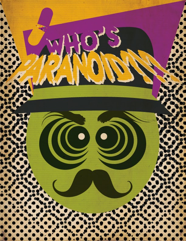
Who's not a Lil paranoid at times. But some people are just crazy. What are you?
Saturday, September 14, 2013
Wednesday, June 19, 2013
New westindi logo (jev)©
So this is the new logo I've been wanting to change to for a very long time now. With the new look, it's a bit more Caribbean now, a lot fresher and flat.
It's also a play on those 80's beach tees I used to have growing up and being from the islands those type of designs were/are always in style.
This will be my standalone logo sig for profile pics. When you look at it, it's a bit hard to see exactly what it is but that's ok. That's how I wanted it. It's the beach house window shutter view.
For the W I used three of them to give me the shape I was going for, I wanted it to look like a beach hut or a lifeguard's tower. This meant having to go through a ton of typefaces until I found the one that would work best.
I also wanted it to flip, so that you would always see the W with any three colours I chose.
And this last one is all the elements together. Both the Colour and Black & White.
It's also a play on those 80's beach tees I used to have growing up and being from the islands those type of designs were/are always in style.
This will be my standalone logo sig for profile pics. When you look at it, it's a bit hard to see exactly what it is but that's ok. That's how I wanted it. It's the beach house window shutter view.
I also wanted it to flip, so that you would always see the W with any three colours I chose.
Tuesday, May 21, 2013
my dog (jev)©
Dogs have opinions on design matters too. Sometimes, maybe.
And sometimes a dog is just a dog. Why all the Comic Sans hate?
Sunday, May 19, 2013
Saturday, April 20, 2013
Blood Diamond (jev)©
This was a poster i did like two years ago, not sure why i never got around to posting it up.
If you had to choose one scene from the movie to sum it up, i think this would be the one (spoiler alert).
Subscribe to:
Comments (Atom)


2.jpg)
.jpg)
.jpg)
.jpg)
.jpg)


